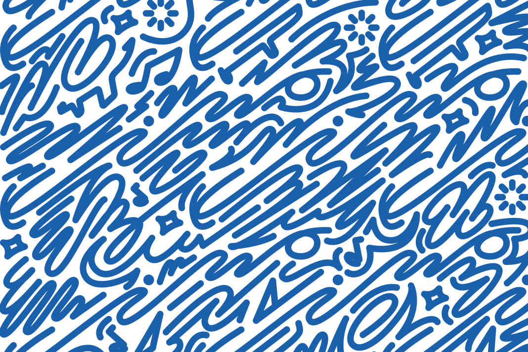


For many decades, the annually redesigned poster has been one of Kieler Woche's favourite standard features. With its almost iconic status, it is far more than a mere advertising medium - it embodies the identity of the event on the shores of the fjord and beyond. The changing designs, sometimes kept simple in blue, sometimes colourful and abstract, but always with an unmistakable visual language, are an expression of international solidarity and at the same time a testimony to their respective time of origin. Browsing through the posters is therefore like travelling through time.
Historical development
The history of the Kieler Woche poster goes back a long way; the sailing competitions in 1948 were a new start for the poster. After the catastrophe of the Second World War, the aim was to emphasise the international character of the event. As a result, the first post-war poster featured the colours of Schleswig-Holstein as well as those of its Scandinavian neighbours. With the founding of the Federal Republic of Germany in 1951, black, red and gold were added to the circle of participating countries, complemented by the flags of the Western Allies. This conceptual line from reconstruction to the present day reflects the development of Kiel Week as a major international event.
Maritime design elements
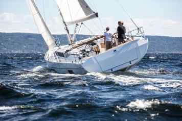
Despite all the artistic freedom, it is in the nature of things that maritime motifs play a central role in the design. In addition to flags and sails, waves are a recurring element - as are the characteristic colours of the fjord in good weather: white and blue. These elements can also be found in the winning design for the 2025 poster, which summarises the essence of Kiel Week.
Competition and selection process
Since 1959, the choice of poster has been decided by a competition. Participation in this exclusive circle is already highly recognised in the design industry. The selected artists have to be true all-rounders: since 1974, the task has included adapting the motif and logo not only for the poster, but for a whole range of applications - from flags to bottle labels. This versatile use emphasises the importance of the design as the visual figurehead of the entire event.
Winning design 2025
Bochum-based artist Cihan Tamti won over the jury for Kiel Week 2025. He prevailed against five competitors. The jury's statement suggests a particularly successful design: "His design already whets the appetite for Kiel Week 2025". Awakening this anticipation and at the same time capturing the spirit of the event is the art behind the Kieler Woche poster - a tradition that will be continued in the future and carry the maritime flair of the fjord into the world.

Lars Bolle
Chief Editor Digital
